ApplyTime
Overview
CappUXcino & Coffee is a local UX mentor group I am a member of, and said group puts on an American Idol style competition called UX Idol. I was one of four presenters for UX Idol 2.0, for which I designed the following web application to encourage more active involvement in the job application process. My final presentation won both the judges’ and the people’s votes.
The Problem
People end up in boring jobs because they lose the motivation to pursue the ones they want. Why?
1. Tedious applications
2. No actionable feedback
3. Difficulty following up
Users & Audience
There are at least two sides to every story. The two I decided to focus on are:
1. Job Applicants
2. Recruiters
Roles & Responsibilities
I worked individually on this entire project, with some graphic design assistance from a good friend of mine. However, throughout the time leading up to the final event, I was able to discuss my work with my peers and mentors in controlled practice sessions, building my confidence and honing my speaking skills.
Scope & Constraints
This project was constrained to a couple of months, during which I utilized time available during weekends and between shifts at my full time job.
The Process
Contextual Inquiry
My research consisted of the following methods:
1. 10 user interviews (or as I considered them, organized conversations) with recent graduates actively applying for entry-level positions and young adults who already work
2. Online research (via Linked, Reddit, and other media platforms)
3. Personal experiences I have had applying for jobs

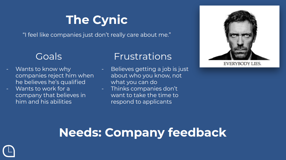
Establishing Personas
Based on the results of my interviews and web research, I decided to focus on two main types of job seekers, which I distilled into the following personas:


Defining Needs
The main user needs were defined as the following:
1. A way to keep job applications organized
2. A safe, anonymous forum for receiving feedback on rejections
3. A painless method for following up

Ideation
I drew much inspiration from forums like LinkedIn and Indeed, but they have their downfalls.


I needed to figure out a way to keep things simple while still assuring the users were engaged in the process, not just applying to jobs and forgetting about them.
Prototyping
To prototype my ideas, I started on paper, then moved those sketches over to Figma for distribution. I chose Figma because I work on both Windows and Linux machines, and it just makes sense for me to use something completely cross-platform.


I included three key features that correspond to the three major user needs I established earlier:
1. Reminders to follow up on past applications
2. Easy access to company contact information
3. A message box for sending and receiving anonymous feedback
Reflection
Impact
I want to continue working on this project and hopefully develop a full fledged web application, because I believe it really will humanize the job application process again.
1. Recruiters will feel safe to actually send feedback
2. Applicants can improve themselves with better direction
3. Fewer people will get stuck in "convenient" jobs
4. World happiness rises
What's Next
A product is never really finished, and this one is no exception. Of course I need to do the programming and build the web app, but before I even start thinking about that, I need to do more user testing and iterate on my prototype. I always keep this flow in mind when working on my projects:
